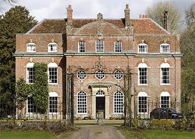
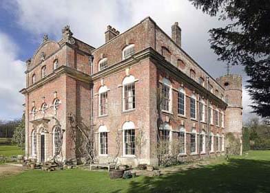
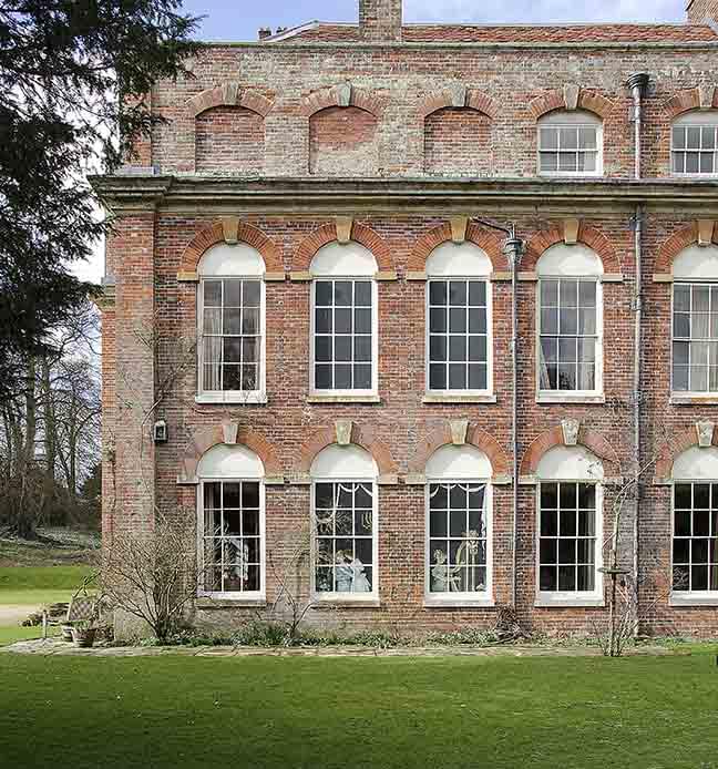
No discussion on the subject of blind windows can be complete without examining the varied forms of treatment that have been applied to blind openings, ranging from a rudimentary depiction of a casement or sash window — plain white lines painted on a black background in a two–dimensional imitation of frame and glazing bars [1], to fancy ‘pictorial’ or realistic three–dimensional representations of windows — trompe–l’oeil effects [2], discussed in Note 6. Both types attempt to deceive the eye, as the French word indicates, but the ‘fancy’ version does so more vigorously and with more panache. In describing these two basic approaches to the handling of blind windows what single word can be used to categorize both?
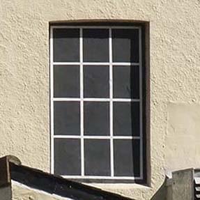

1. [left] A typical plain false window in imitation of double–hung sashes.
2. [right] An untypical false ‘fancy’ window in imitation of folding casements.
FICTIVE, FEIGNED, FAKE, FALSE?
Each of the painted blind openings in the illustrations above is pretending to be something else, but the obvious term ‘pretend window’, while accurate enough, is perhaps too reminiscent of the nursery for comfort, as is ‘dummy’ window or dummy sash. Other terms might be suitable were they not habitually linked to a particular noun — ‘sham’, for instance, so often linked to ‘–castle’; ‘mock’ paired with ‘–heroics’ and ‘–turtle’; and ‘fake’ immediately bringing to mind jewellery or painting. Other similar candidates are ‘imitation’, ‘feigned’, and ‘phony’. ‘Imaginary’ is not a word that springs immediately to mind in the present context, indicating as it does the idea of a window that exists solely in the intellect. The French use this word however in the sense of ‘simulated window with representations of human figures’, as we shall see in the ‘fenêtres imaginaires’ example below. ‘Painted’ can refer to the liquid coating on a window, or to a depiction of a window, plain or fancy, in a blind aperture — three options and therefore too confusing for accurate use.
The word ‘false’ — as opposed to ‘fake’ — seems more applicable. ‘Fictive’, meaning ‘creating or created by imagination’, is precise and would be useful if it were in everyday use, which it isn’t ‘Pseudo’ is a word employed by architectural historians in the term ‘pseudo–arch’ — an arch that is not what it seems — but who has ever heard of a ‘pseudo–window’? Let us stay with ‘false’.
THE PLAIN FALSE WINDOW IN HISTORY
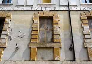
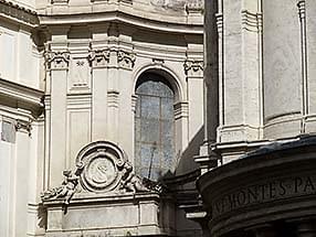
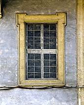
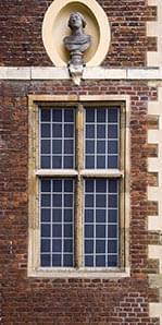
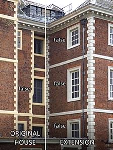
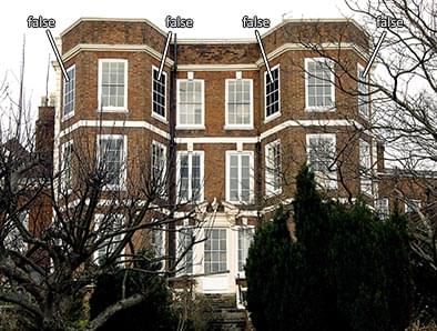
3. [top left] Teatro Olimpico, Sabbioneta, Italy; 1580–1585. 4. [top centre] Santa Maria della
Pace, Rome; restoration of 1556–1567. 5. [top right] Typical Roman nineteenth century domestic
false window. 6. [bottom left] Ham House, Surrey; part of original house of 1610. 7. [bottom centre]
Ham House; original house and 1670s addition. 8. [bottom right] A Georgian house in Shrewsbury, Shropshire.
When the sixteenth century architect Vincenzo Scamozzi was building the Teatro Olimpico in Sabbioneta, northern Italy, he wanted to keep out unnecessary light but at the same time needed to clothe the exterior with the customary architectural elements and enrichments, so he adopted the device of the blind window painted with a rudimentary representation of the type of mullion and transom window then in current use [3]. At the church of Santa Maria della Pace, in Rome, the sixteenth century remodelling of the façade displays blind windows [4] painted in the form of square and lozenge–shaped lights within a timber frame. In this Italian example of a domestic window [5] of unknown date the treatment is similar to that of the Sabbioneta window, but with clearer definition of the opening casements. At Ham House in Surrey a blind window has been painted to match the adjacent stone–framed lights [6], but a nineteenth century painting of the house shows that this particular window was at one time blank. Elsewhere at Ham the treatment of the blind windows follows the date of the fabric [7] — the grey–painted mullion and transom ‘cross’ windows replicate the windows of the early seventeenth century part of the building, while the others are painted to look like the newly fashionable sash windows installed in the extension that was added later in the same century. Later examples abound; this house in Shrewsbury [8] displays typical false windows of domestic buildings of the Georgian period, such as can be found throughout the whole of Britain. In none of the above instances can we be certain, of the exact date that the false windows were created. Paint is such a relatively fragile medium when used externally that most will have been over–painted or refreshed at some time, and only scientific investigation of successive layers can give us the full picture.
THE PLAIN FALSE WINDOW . . . as the smuggler’s friend.
Gunsgreen House, Eyemouth, Berwickshire
The Act of Union of 1707 between England and Scotland brought with it a new series of duties or taxes on goods, which in turn caused a huge increase in the amount of smuggling taking place on the southern coasts of Scotland, both east and west. Enormous profits were to be made in the clandestine importation and storage of contraband goods, material on which excise duty had not been paid and could therefore be sold on at a lower price. The popular image of smuggling has traditionally been conceived around rocky coastlines with handy little coves, nefarious nocturnal deeds, and secret passages and hideaways — not entirely without justification. But it is possible to find a more sophisticated class of smuggler — the apparently respectable merchant who leads a double life and successfully confounds the exciseman, at least until found out.
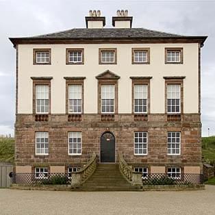
9.[left] Gunsgreen House, Eyemouth, Berwickshire.
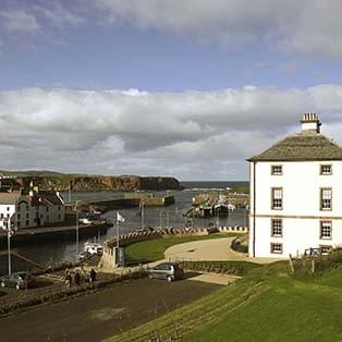
10. [right] Gunsgreen House, overlooking the town and harbour.
Just such a man was John Nisbet who, with his brother, smuggled tea into Scotland from the Swedish town of Gothenburg, gin from the Netherlands, tobacco from the American colonies and the West Indies, and brandy and claret from France, while carrying on a legitimate trade in other forms of merchandise as a smokescreen. By around 1750 the proceeds were sufficient for him to commission one of the brothers Adam, renowned Edinburgh architects, to design a mansion for him, on the border with England, in a prominent location in the trading port of Eyemouth — which he named Gunsgreen House [9, 10] — from which he continued to carry on his business and his lucrative smuggling sideline. For the latter purpose he caused alterations to be made within the house for the purpose of hiding contraband goods; these included concealed storage spaces under the floors, and a ‘tea–chute’ — a tin–lined box running vertically through two floors, with a draw–off point on the lower floor. By lifting a floorboard in a corridor on the top floor Nisbet’s men could pour the contents of six chests of loose tea, where it lay hidden until the time came to sell it.
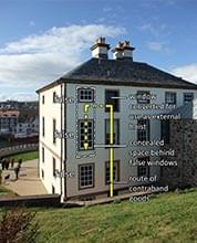
At some point Nisbet had also decided to use the top two floors as his warehouse, with one top floor window converted for use in connection with an external hoist, restored in a recent refurbishment. This had a beneficial side effect in that he was able to block up half the original 48 windows and thus reduce his Window Tax burden (also a result of the Act of Union), which at that time in Scotland stood at a shilling a habitable room window for any number over 20. He eventually blocked up more windows in order to bring the total number down to 19 and thus reduce the tax per window to nine pence, a saving of 25%! Any blocked–up window on the outer face of a thick masonry wall creates a space behind it which can easily be covered over to form a cupboard or a concealed storage space for goods, legitimate or otherwise, and in a recent refurbishment of Gunsgreen House as a museum (of smuggling!), a wedding venue, and self–catering accommodation, a number of instances of this occurrence came to light. Local historians have puzzled over the manner of use of one such hidden space [11], which has been preserved in the adaptation of the building (much altered over the last two hundred and fifty years) to its new use, and have surmised that an existing original beam at roof level supported a pulley block that would be used to hoist items in and out of this otherwise inaccessible area. An obstructing beam at lower level [12] appears to have been modified with the purpose of allowing the passage of sacks or other bulky objects, hence the large semi–circular cut–out in the beam. The false windows in question are shown on illustration [13]. The yellow line indicates the route taken by contraband goods arriving at Gunsgreen House, while legal merchandise would be distributed generally over the upper floors.
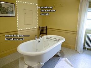
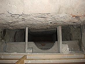
11. [left] The top floor room with the hidden space and access door in the wall, presumably originally
disguised in some way. 12. [centre] The view looking down through the door in the wall; the back
of the blocked windows on the outside can be seen in the upper half of the picture.
13. [right] The back of Gunsgreen House showing the route taken by illicit goods.
THE PLAIN FALSE WINDOW . . . with a railway background.
Fowler’s Ghost and 23/24 Leinster Gardens
It is difficult to imagine what possible connection there might be between the Forth Bridge and a group of false windows in West London, especially when it is known that the link between them involved an expensive and disastrous experiment in locomotion. The bridge in question is, of course, the one and a half mile long Forth Railway Bridge linking Scotland’s capital city, Edinburgh, with the North East, across the Firth of Forth. Opened in 1890, it had been co–designed by Sir John Fowler and Benjamin Baker, replacing Sir Thomas Bouch whose Tay Bridge had caused great loss of life when it collapsed in 1879. Fowler had been employed in this connection despite his close association with an earlier experiment — a locomotive that had failed spectacularly to fulfil the function for which it had been designed. The abortive experiment was the subject of a cover–up and the locomotive never ran; because its whereabouts remained a mystery for many years it eventually came to be known as ‘Fowler’s Ghost’.
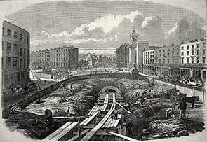
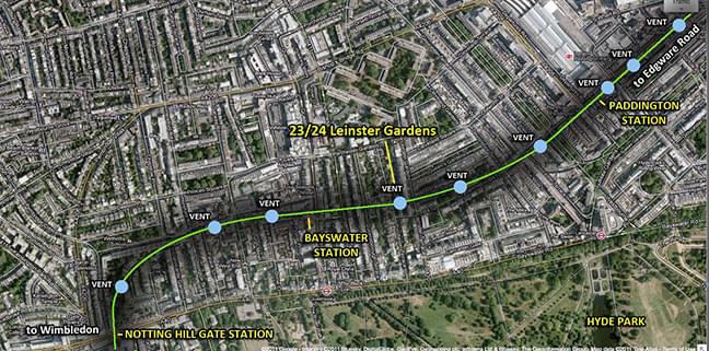
14. [top left] Underground railway building in Victorian London by the ‘cut–and–cover’
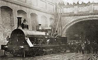
method. 16. [top right] The fireless locomotive, Fowler’s Ghost, seen here at a vent point.
15. [bottom] Railway tunnels needed ventilation, open to the sky. Not all tunnels could be
routed along the line of roads — some had to pass beneath existing buildings.
When the world’s first underground railway was projected in London in the late nineteenth century it was realised that smoke and steam in any volume — not a major problem in the case of short tunnels on main line railways — would be unacceptable to customers over a protracted distance, to the extent that the exercise would be ultimately self–defeating. Existing railway tunnels at that time were furnished with ventilation ducts at intervals with a view to allowing smoke and steam to escape. The Metropolitan Railway Company proposed a railway line in West London with thirty–four stations (nine of these underground), which was eventually opened in 1863. The line was constructed on the ‘cut–and–cover’ principle, in which the underground railway follows the route of principal roads wherever possible [14]. In this system the road is excavated, the track laid, and the road replaced, supported by beams or arched masonry structures, with gaps left along the route wherever possible for locomotives to vent off smoke and steam [15]. The Company employed Sir John Fowler to design a steam locomotive [16] that would minimise production of both while in the tunnel system, obviating the need for areas open to the sky (an important consideration when the line is buried under the road).
Fowler reasoned that if the combustion gases could heat a large solid mass in the locomotive while on the open track then the energy thus retained could be used to heat the boiler when the locomotive was in the tunnels, rather like a modern hybrid vehicle which may be powered alternately by either petrol or electricity, this being generated by the petrol engine and stored in batteries until needed. The 32–ton engine was built by Robert Stephenson and Co., and used firebricks as the heat storage medium. Dampers were provided that could be tightly closed to prevent smoke emission; at the same time a condenser system was to have minimised the amount of steam emitted. In 1861 the ‘Ghost’ was tested on a mainline track outside London; after seven and a half miles the condenser failed to condense, leading to concerns that the boiler might overheat and burst, and the experiment had to be abandoned. The second and final trial went no better because, as a railway writer put it later ‘the trouble was that her boiler not only refrained from producing smoke, it produced very little steam either’— a major disadvantage in a steam engine.
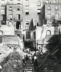
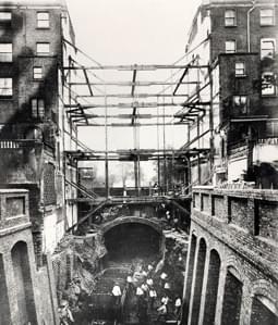
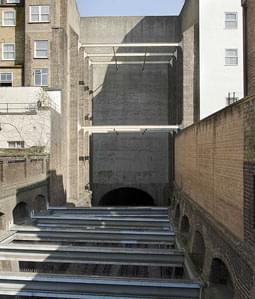
17. [left] The destruction of 23/24 Leinster Gardens to accommodate the Metropolitan Railway
Company’s new line. 18. [left] Work in progress. 19. [right] The same view today.
Had Fowler’s locomotive been successful it would have reduced the output of smoke and steam and therefore the need for the number of open stretches of track where venting could take place, and would almost certainly have at least doubled the distance between open cuttings. This had been original the intention of the Metropolitan Railway Company but their efforts in this direction were frustrated, and they judged that seven or eight ventilation openings would be needed for every mile of track. This was the first underground railway to be built; there were no precedents to be followed in 1860. Steam was the only locomotive power available until electric power was introduced forty years later, so that planning the route would have had to take into account not just the surface road pattern, but the unavoidable need to tunnel under certain existing buildings, and the availability of suitable ventilation opening sites along the way, at more or less fixed intervals. In planning and building the route through Bayswater (now the District line between Wimbledon and Edgware Road) a major obstacle was encountered at Leinster Gardens; this was a location where ventilation would be needed but which was occupied by a newly built terrace of expensive houses. The Company clearly felt that it had no alternative but to buy two of the properties and to demolish them — leaving a huge and unsightly gap [17], which they were then obliged to screen off with a false wall [18], complete with false doors and windows in imitation of the adjacent houses.
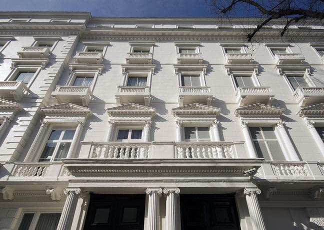
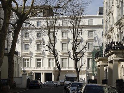
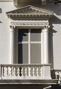
20. [top] Nos. 23/24 Leinster Gardens, on the right of the picture. 21. [bottom left]
At roof level, a clue to what lies behind. 22. [bottom right] First floor false window
detail in imitation of nearby French windows.
These are described in Pevsner’s Buildings of England, London 3: North West, as ‘sham fronts built to preserve the respectable monotony of the terrace against the intrusion of the Metropolitan Railway, which emerges here’ [19]. English Heritage has listed them Grade II, as ‘Nos 19 to 22 (consec), including No 19a and screen wall forming equivalent of Nos. 23 and 24’. They form part of the original terrace with Nos 32 to 48, the intervening houses having been demolished and rebuilt relatively recently. Each stucco–fronted ‘sham front’ is two bays wide and four storeys high, but lack the attic mansards of the adjacent houses, a detail only seen from some distance away [20]. The continuous balustraded balcony is repeated, as are the pedimented square–headed windows, each flanked by fluted Corinthian half columns, but instead of plate glass panes these windows are furnished with solid panels painted mid–grey, a departure from the more usual black, which was presumably thought to be too harsh a contrast with the white painted stucco. The window ‘panes’ are separated from each other by a false mullion and transom ‘frame’, repeating either the two–over–two pattern of the adjacent upper floor windows, or the French casement windows of the first floor [21].
PLAIN FALSE WINDOWS . . . THAT CAME AND WENT.
Biddesden House, Wiltshire, 1711
When General John Richmond Webb retired after a career that took in service under John Churchill, 1st Duke of Marlborough, and a number of notable battles including Blenheim, he retired to a house [22, 23] at Biddesden, built for him by an unknown architect, perhaps one of the local mason–architects who were building in a similar style in Salisbury and Newbury; it has been suggested, not without justification, that he may even have had a hand in the design himself. Pevsner, in his Buildings of England: Wiltshire describes it as ‘a very remarkable house . . . (which) belongs to the Vanbrugh–Hawksmoor–Archer group’, implying in this comment an attractive robustness and theatricality about the design, worthy of a designer of national repute. On the other hand, none of the commentators who have written about Biddesden have drawn attention to the idiosyncratic treatment of the brickwork at the window reveals — the unorthodox manner in which the reveal is created by the use of quarter bricks on alternating courses (a decision forced on the builder by the conflict between the choice of pier width and the need to maintain the regular pattern of Flemish bond with blue vitrified headers over the whole façade?) — tending to suggest local rather than national involvement, at least in the fine detailing. The three–storey west, east, and south façades are said, by the authors of Volume 15 of the Victoria County History: Wiltshire, to have been built over a number of years in three separate phases, west, south, and east, in that order; this they deduce from internal irregularities that show in the plan despite an apparent general external symmetry. Each elevation is seven bays wide, with a sash window in each bay on the principal floors, very much in the fashion of the time — the new sashes being a powerful status symbol and indicator of wealth (see Note 1). On the east and west sides ‘the aqueduct rhythm of the . . . closely–set arched windows’ is, in Pevsner‘s words, ‘particularly impressive’.
As there are no known extant floor plans of the house as it stood at the time of first occupation, nor any contemporary external views, it is impossible to say whether or not all of the openings at that time contained an actual window, or whether some were built deliberately as blind windows. It is known that several second–floor bedroom windows were blocked up at some time in the first two hundred years of the building’s life, perhaps to reduce heat loss through draughty windows in winter, and that a few of the first floor windows were blocked and opened up again later: that this is so we can deduce from floor plans drawn up in 1907 at a time when ownership changed.
It seems likely that daylight and sunlight levels could also have been a factor in making the resulting changes to the fenestration. We saw in Note 4 that the seventeenth century architect Roger North advised his brother to ‘have above half the lights stopt up’ when refurbishing his Jacobean house at Wroxton. But fashions change, and in 1865 we find Robert Kerr taking a contrary view and advising, in a chapter on light and air in The Gentleman’s House, or How to plan English Residences that: ‘It is a never failing principle to err here on the side of excess . . . both light and ventilation are easily diminished, but to increase the supply may be impossible’. When building regulations were first introduced it was considered that the total window area of any habitable room should be not less than 1/10th of the floor area of that room, and that standard has remained in place until the present day. Maximum areas of glazing were not originally imposed by regulation because the self–limiting effect of the state of early glazing technology and consequent expense of large panes made this unnecessary. At Biddesden it is further possible to conclude from measurement of the floor plans that if the house were to be fully windowed, with glazed sashes in all openings — taking the 1/10th rule as a general benchmark — then the habitable rooms on the ground and first floors would be over–lit by an average of two and a half times the norm.
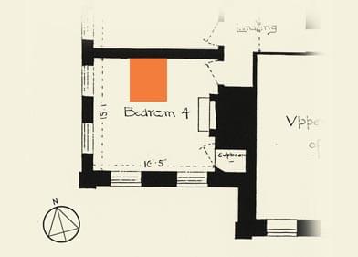
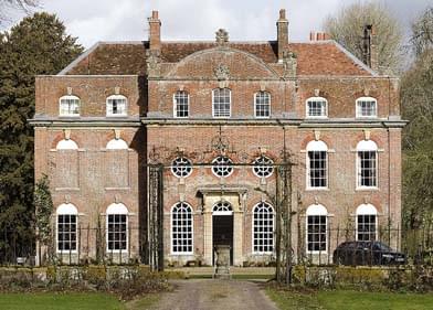
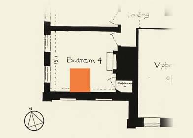
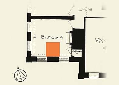
25. [top left] Plan of the first floor bedroom as built, with a hypothetical three–quarter bed
shown against the only available blank wall. 26. [top right] The south facade, showing the
unfortunate visual effect of literally bricking up the two bedroom windows. 27. [bottom left]
The bed now shown against the new blank wall. 28. [bottom right] A double bed, shown
in its current location against the ‘opened–up’ window wall.
As it is, the actual figure is not very much below this level, which could help to partially explain the occurrence on the 1907 plans of two blind windows at first floor level on the south side of the house (the entrance front and therefore the principal elevation), ranged together at the south–west corner of the building [25, 26]. It is inconceivable that this façade would have been planned in such a blundering way, so we are led to the conclusion that these two windows must have been blocked up at some time before 1907, or that the plans show a proposal to block them up in order to reduce the amount of sunlight entering the room and so restrict damage to furniture and furnishings, and at the same time to cut out draughts. But there may be another influencing factor, which may be found in the use of the room — a bedroom. One wall is occupied by a fireplace, two walls are each occupied by a pair of large windows, leaving a fourth wall as the only possible position for the bed, with its head against this wall and with the door opening directly onto the bed, an offence against decency and decorum at that time [24]. It would not be too fanciful to see the hand of Robert Kerr guiding the owner in the re–planning of the room:
In the case of Bedrooms it is too much the practice to allow the plan of rooms to go by chance, leaving the furniture to be placed, and other internal arrangements for occupation effected, as best may be. But for so unintelligent a mode of proceeding there cannot be any real excuse . . . Take the most usual kind of Bedroom . . . a room of good size, about square in form, with the window in the middle of one side, the fireplace in the middle of another side, and the door in one angle [corner]. We may at once make it a rule to place the bedstead . . . with its side to the window, rather than its foot. By this means the light is favourably placed, whether for a sleeper or for a sick person . . .The next rule is that the side next the window ought to be the left side . . . The door thus goes to the right side, and the fire ought then to be placed opposite the foot of the bed. The door . . . must open with its back toward the fire (the rule for all doors) . . . this position allows it to open also with its back toward the bed (equally a rule). In a superior room there will be nothing positively at variance with this arrangement.
Following Kerr’s advice we now have what he would consider to be a ‘superior’ room, with only the position of the fireplace at variance with his recommended arrangement [26]. Today’s occupants of this room, discarding the orthodoxies of a hide–bound and propriety–obsessed age, have placed the bed exactly where they want it — against the opened–up windows on the south wall [27].
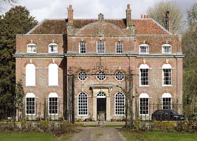
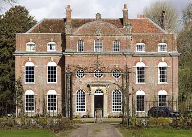
29. [left] The undesirable effect of painting the blind windows white to match the
over–panel is seen here. 30. [right] The standard blind window solution — plain white lines
on a black background. (Note the difference between the original pattern of glazing with thick
glazing bars at the centre of the façade and the later sash windows with thin glazing bars).
The practical effect that literally bricking up the windows would have had can be seen in [25], emphasising the unfortunate effect of the internal re–planning on this important facade. We can see in [28] the unhappy result of painting the brick (which might have replaced the window) to match the semi–circular over–panel; it becomes clear that the obvious answer would be to paint a window back on [29]. We might tentatively assume that this was the case from the appearance of the first floor windows of the east elevation where this solution was also adopted [30], (albeit for other reasons, see Note 6). But we would be wrong, as a photograph (which cannot be reproduced here for copyright reasons), published in Country Life in 1919, shows that in fact the bedroom windows in question, those on the south front, had been left in position and a solid wall built behind them; and that in order to disguise this wall from outside view the panes had been painted over, or blank panels inserted in place of the glass. We know from another Country Life photograph taken in or around 1938 that the situation was later reversed — the internal wall taken down and the windows cleaned up. In this photo a single bed is shown with its head end against the south wall, sitting with head end toward the windows but protected from light and draughts by a large folding screen, a pragmatic solution to what would be regarded by the author of The Gentleman’s House as a difficulty only to be solved by extensive physical intervention.
Biddesden House is not open to the public, except for two ‘Heritage Open Days’ in September.
Acknowledgements
(All photographs and drawings are by the author unless indicated otherwise)
Pictures 14 & 15: Wikipedia PD
Picture 17: London Transport Museum
Pictures 24, 26, 27 based on plans in the Biddesden archive.
The close cooperation and assistance of the owners of Biddesden House is gratefully acknowledged.


